Waffles are for Breakfast
It’s been a long time since my last update and I’ve decided to start with Tableau, of all topics! Although open source advocates do not look kindly upon Tableau, I find myself using it frequently and relearning all the stuff I can do in R. For my series of “how-to’s” regarding Tableau, I’d like to start with posting about how to make a waffle chart in Tableau. Why? Because Tableau DOES NOT offer a template for this chart – You need to make it using your own ingenuity. And that is interesting.
Without further ado:
What’s a Waffle Chart?

There are a gazillion ways to depict an amount. Bar charts and pie charts are common, maybe you’ve even seen an area/tree chart. But variety is the spice of life – repeatedly looking at bar charts becomes tiring. Enter the waffle chart. It has the appearance of a waffle iron – a grid of squares which can be colored to represent an amount.
Since this isn’t available in Tableau, if you want to create one, you’ll need to be, err, creative.
Setting Up
For this tutorial I will use the famous iris dataset. You can find it anywhere, but it is primarily hosted at https://archive.ics.uci.edu/ml/datasets/iris. Download it and get it into Tableau. Important - Make sure that your spreadsheet software creates an “ID” variable for each row (a row number for each row), and read it as a dimension. I’ll call mine F1.
Some things to figure out:
- How to make a grid with your data (conventionally, a 10 x 10).
- How to assign color to the squares/marks in that grid.
- The calculation that will be used to create the color assignment.
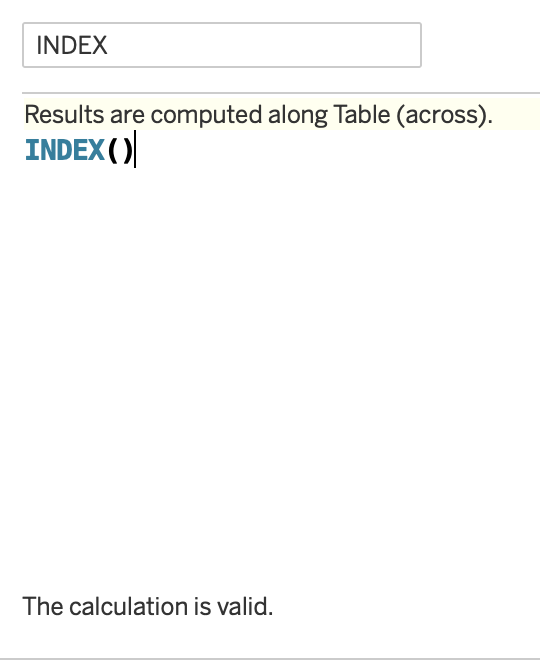
Of course, there’s always more than one way to do things in Tableau. I’ll show my unique way of building a waffle chart which serves my data needs quite well. Let’s start by creating an index. To do so, all you have to do is make a calculated field with INDEX() in it.
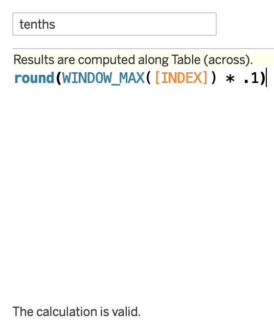
Next up, let’s figure out how many rows are in a “tenth” of the data so that we can partition the data into 10 clean rows. Divide the maximum value of the index by 10 or multiply by 0.1. Note it is important to use ROUND to square off the value. If not, you will have rows of unequal lengths due to uneven division.
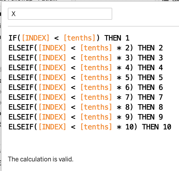
To make the X-axis from here, I simply assign values based off of where their index stands in relation to each tenth percentile.
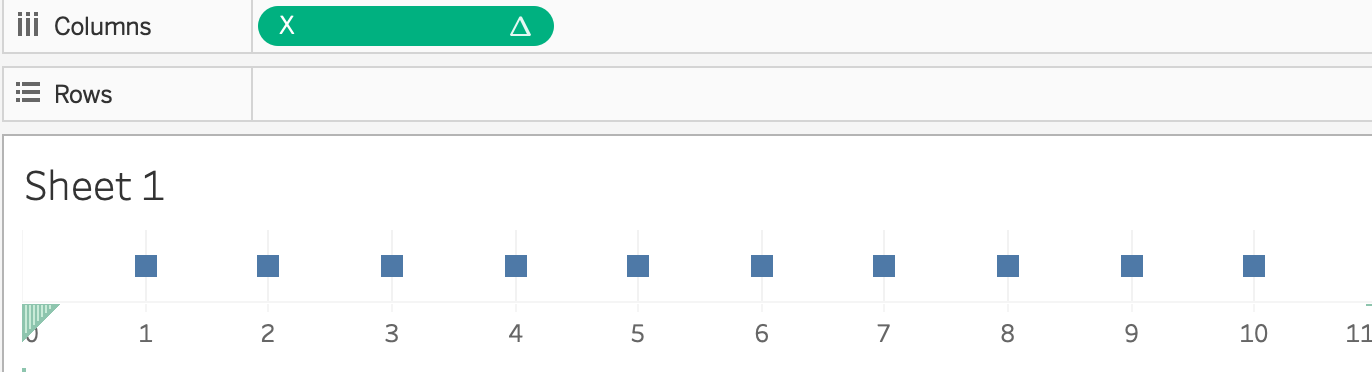
At this point, by placing your newly created X variable on the rows shelf and choosing to “compute using ____” (your dimension/row-level ID variable), you can see a neat row of marks as such:
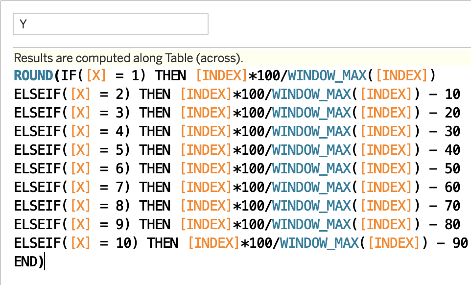
We’re halfway there! Now we need to expand this single row into 10 Y-values. To do this I multiply the index value by 100 and divide by the maximum index value. This is exactly what it sounds like - a percentage. Note that rounding the values to the nearest integer is very important so that we can obtain integers of 1-10 instead of a continuous range of values.
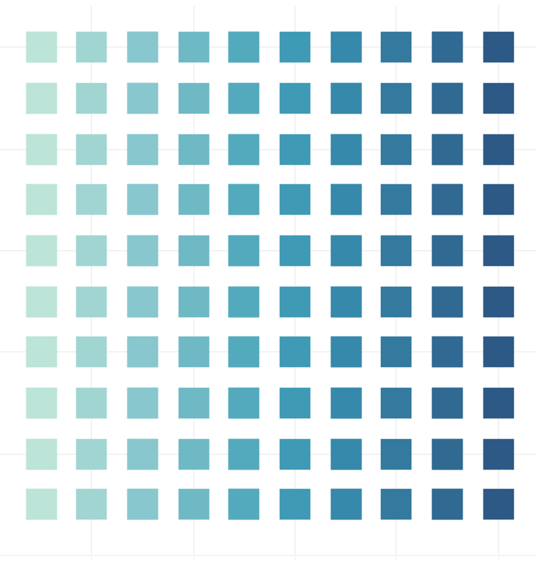
The result is not a beautiful 10x10 grid, but a beautiful 10 x 11 grid. What happened?
This is due to the rounding we did above - for each tenth percentile partiion of X, the bottom portion of the Y values were closer to 0 than 1, which means they were rounded down. (A CEILING or FLOOR function would have been better than ROUND, but those 2 calculations unfortunately weren’t an option.) Other tutorials may have a workaround, however, those means require their own unique workarounds as well. At the end of the day, you’re probably going to need a workaround. Here is mine:
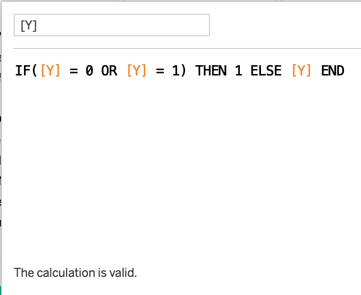
Simply fold the 0 and 1 Y values into each other with another calculated field, as such.
 And we get ====>
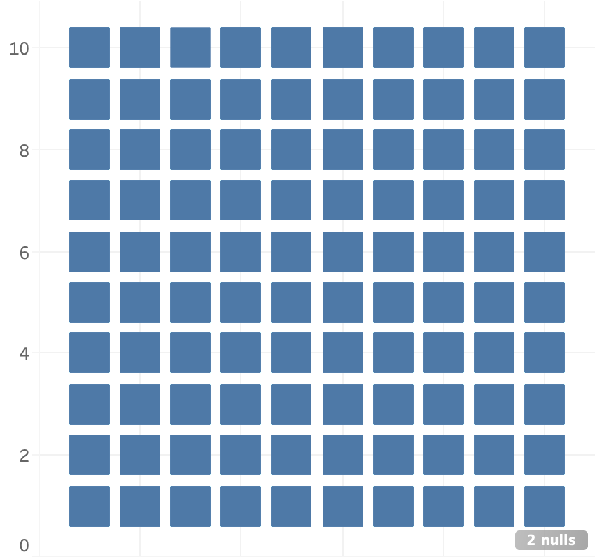
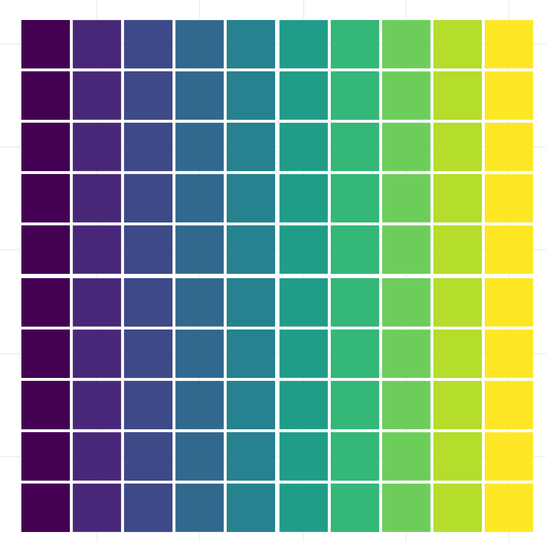
Voila! Now we have our “template” for a waffle chart! Not that it was probably not necessary to fold all the values of our data into the chart.
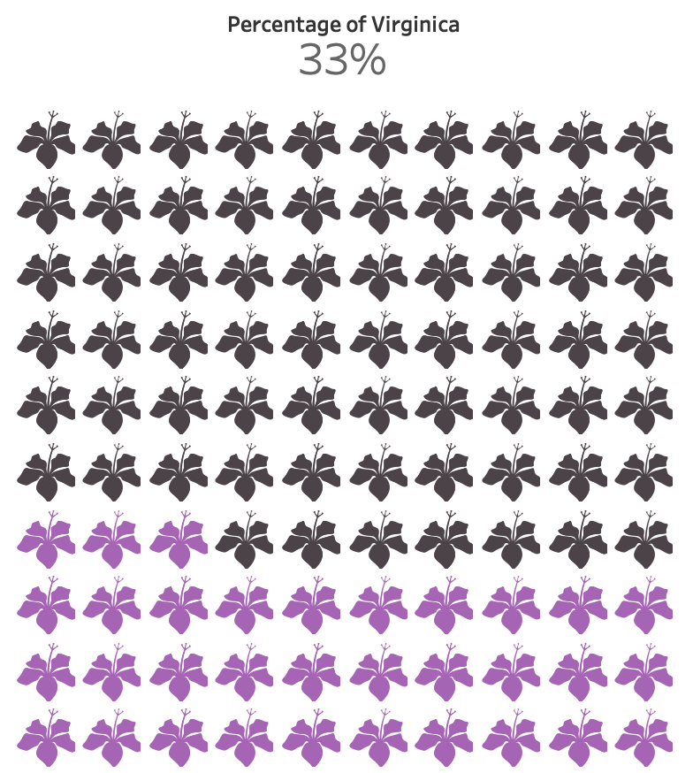
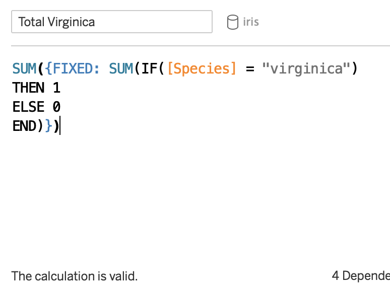
But we can’t eat waffles yet - we need to assign color to it first. I suppose I’ll color the waffle chart based off of the percentage of Virginica species in the Iris dataset. Notice that I need to use fixed LOD calculations for this. Since the “View” influences calculations, it is best to work with an LOD which will compute the calculation first in spite of whatever is happening in the view. If you have trouble with LOD’s, stay patient and get comfortable with them because they’re great.
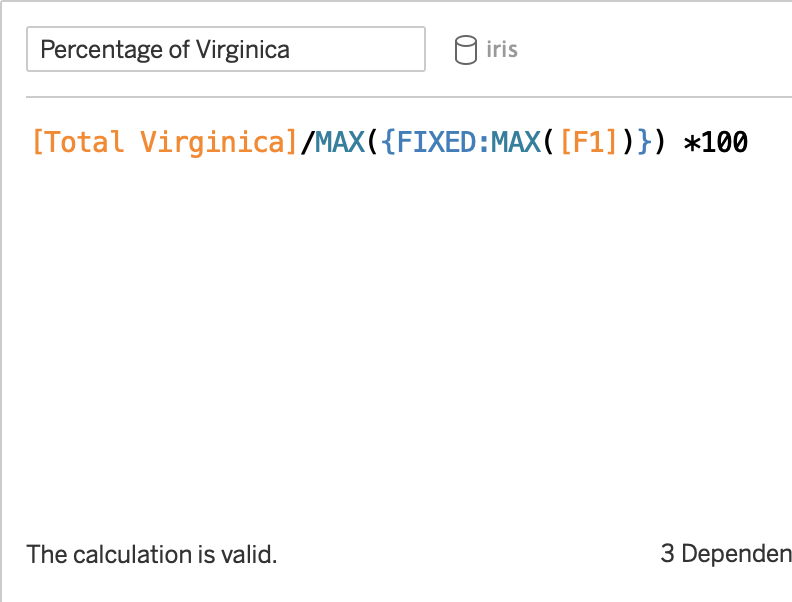
Now we are ready to assign a color using the percentage variable. The logic is profoundly simple once you figure out the concept. Essentially, you need to tell Tableau to color a mark based off of the values it is less than. That means, multiplying X values by 10, Y values by 1, and starting by looking at the next row. This calculation handles all possibilities, except of course decimal values/partial shading.
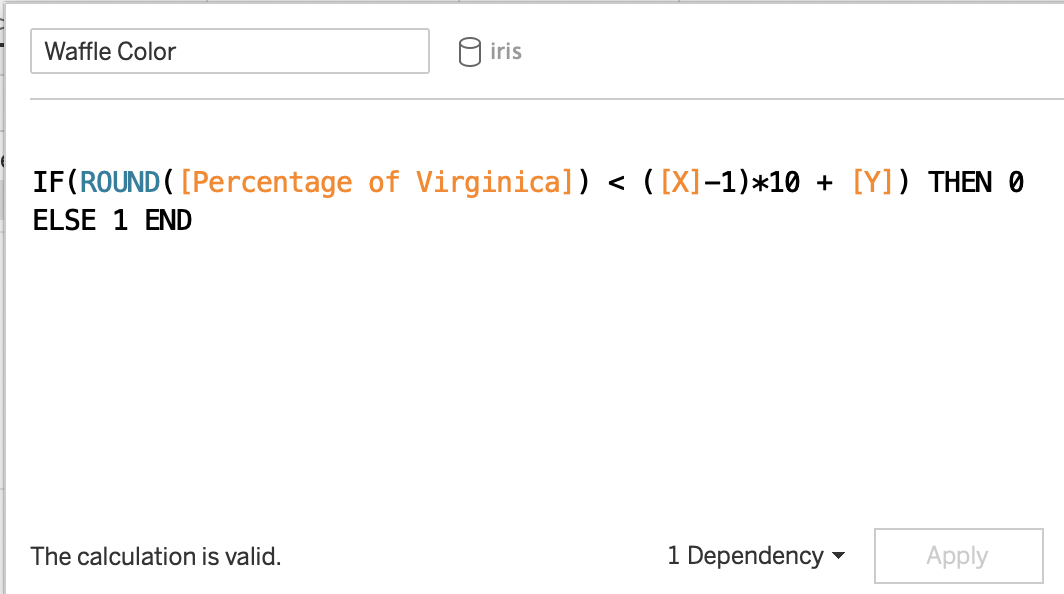
Presto! From here on we have our chart, but we can further enhance and customize our beautiful waffle chart! If you wish to take it a step further, create a custom shape from your favorite image software and use that as a custom mark. Remove axis lines, grid lines, & labels, and perhaps even add the percentage calculation to work with the visual.
 Vs
Vs