Today I’d like to work a little on geospatial mapping in R, so I’ve chosen a small dataset (only 256 kb) that can be plotted on a map. It the location information of Fortune 500 company headquarters in the US. You can download it from here.
R has several choices for plotting geospatial information. Here I use ggmap, however in the future I’ll check out the raster and sp packages. Anyway, let’s get started by loading in and cleaning the data.
library(tidyverse)
library(ggmap)
library(RJSONIO)

Fortune_500s <- read_csv("Fortune_500_Corporate_Headquarters.csv")
##Change case of relevant columns to lowercase, per convention
Fortune_500s <- Fortune_500s %>% select(NAME, X, Y, ADDRESS, CITY, STATE, ZIP, COUNTY) %>% rename(name = NAME, x = X, y = Y, address = ADDRESS, city = CITY, state = STATE, zip = ZIP, county = COUNTY)
I prefer to keep column names lowercase, so I made sure to select and rename the relevant columns. Especially important are the “x” and “y” variables, which are the geographic coordinates I will use to plot to the US map later.
Before getting into the Google Maps part, let me add two new columns-total count of HQ’s by city, and total count by city and state.
Fortune_500s <- Fortune_500s %>%
  group_by(city, state, county) %>%
  mutate(city.total = n()) %>%
  ungroup() %>%
  group_by(state) %>%
  mutate(state.total = n())
Let’s take a quick peak at three cities and states with the most Fortune 500 HQ’s.
Fortune_500s %>% ungroup() %>%
  distinct(city, state, city.total) %>%
  top_n(3, city.total)
## Warning: package 'bindrcpp' was built under R version 3.3.2## # A tibble: 3 x 3
## city state city.total
## <chr> <chr> <int>
## 1 HOUSTON TX 23
## 2 NEW YORK NY 40
## 3 DALLAS TX 11Fortune_500s %>% ungroup() %>%
distinct(state, state.total) %>%
top_n(3, state.total)## # A tibble: 3 x 2
## state state.total
## <chr> <int>
## 1 CA 52
## 2 TX 56
## 3 NY 53So the top 3 states with the most Fortune 500 HQ’s are Texas at 56 HQ’s, California at 52, and New York at 53. For individual cities, NYC has 40, Houston 23, and Dallas 11. Makes sense.
Now let’s get to the mapping part. Interestingly, with Google Maps, you can customize many elements regarding the appearance. Be sure to choose only what is necessary - mapping too many words or features would be overcubersome. It is actually pretty convenient to specialize the JSON paramaters- simply use Google Maps tool here. JSON looks unintelligable at first, but after a lot of tinkering, I promise you’ll be able to make sense of it, as I eventually started typing the paramaters into the browser instead of using the point and click tool.
Below I used a function to untangle the JSON and and feed it back into the API to download the map. The function does all of the heavy lifting which I kindly borrowed from this blog.
style <- '[{"featureType":"administrative.country","elementType":"geometry","stylers":[{"visibility":"on"},{"color":"#FFFFFF"},{"weight":1}]},{"featureType":"landscape","elementType":"geometry.fill","stylers":[{"visibility":"on"},{"color":"#5f9aba"},{"weight":0.1}]},{"featureType":"administrative.province","elementType":"labels.text","stylers":[{"visibility":"off"},{"color":"#000000"}]},{"featureType":"all","elementType":"labels","stylers":[{"visibility":"off"}]},{"featureType":"administrative.province","elementType":"geometry.stroke","stylers":[{"visibility":"on"},{"color":"#FFFFFF"},{"weight":1}]},{"featureType":"water","elementType":"geometry.fill","stylers":[{"color":"#020c17"},{"lightness":-20}]}]'

style_list <- fromJSON(style)


style <- '[
  {
    "stylers": [
      { "saturation": -100 },
      { "gamma": 0.5 }
    ]
  },{
    "featureType": "poi.park",
    "stylers": [
      { "color": "#ff0000" }
    ]
  }
]'
style_list <- fromJSON(style, asText=TRUE)

create_style_string<- function(style_list){
  style_string <- ""
  for(i in 1:length(style_list)){
    if("featureType" %in% names(style_list[[i]])){
      style_string <- paste0(style_string, "feature:",
                             style_list[[i]]$featureType, "|")
    }
    elements <- style_list[[i]]$stylers
    a <- lapply(elements, function(x)paste0(names(x), ":", x)) %>%
           unlist() %>%
           paste0(collapse="|")
    style_string <- paste0(style_string, a)
    if(i < length(style_list)){
      style_string <- paste0(style_string, "&style=")
    }
  }
  # google wants 0xff0000 not #ff0000
  style_string <- gsub("#", "0x", style_string)
  return(style_string)
}
style_string <- create_style_string(style_list)
Here’s another style string with different paramaters for experimentation later.
style_string1 <- "style=feature:administrative.country|visibility:on|color:0xFFFFFF|weight:1&style=feature:landscape|visibility:on|color:0x126063|weight:0.1&style=feature:administrative.province|visibility:off|color:0x000000&style=feature:administrative.province|visibility:on|color:0xFFFFFF|weight:1&style=feature:water|color:0x17151c|lightness:-20&style=feature:all|element:labels|visibility:off"Now its simply a matter of calling get_googlemap and specifying the coordinates. You could either look up exact coords and feed them in, or simply guesstimate and experiment. Just be sure you don’t run into your API call limit!
mymap <- get_googlemap(center = c(lon = -96.5, lat = 39.50), zoom = 4, style = style_string1)Now let’s FINALLY plot the HQ locations of the Fortune 500 companies to our map.
Fortune_500_Plot <- ggmap(mymap) +
  geom_point(data = Fortune_500s, aes(x = x, y = y, color = city.total, size = city.total), alpha = .6) + scale_color_continuous(low = "#ff7700", high = "red3", guide = "legend") +
  ggtitle("Fortune 500's", subtitle = "|Headquarters by Location|") +
  theme(plot.title = element_text(size = 20, color = "dark orange", face = "bold")) +
  theme(axis.text.x = element_text(angle = -90, hjust = .5, vjust = 0.5, color = "black", size = 11, face = "italic"),
        axis.text.y = element_text(angle = -55, hjust = 1, vjust = 0.5, color = "black", size = 11, face = "italic")) +
  theme(axis.title.x = element_blank(),
        axis.title.y = element_blank()) +
guides(fill=guide_legend(title="HQs")) +
  theme(axis.ticks.x = element_line(color = "#126063", size = 2),
        axis.ticks.y = element_line(color = "#126063", size = 2)) +
  theme(legend.background = element_rect(fill = "#187d80", linetype = "solid", color = "#17151c"), legend.text = element_text(color = "#f08809", face = "bold"), legend.title = element_text(color = "orange", face = "bold")) +
  theme(legend.key = element_blank())

## Let's add the geographic center of the US mainland for kicks

Fortune_500_Plot +
  geom_point(aes(x = -96.5, y = 39.50), color = "red", alpha = 0.5, shape = 21) + geom_text(aes(label = "Lebanon, Kansas"), color = "white", x = -98, y = 38.5, size = 2.5, alpha = .3)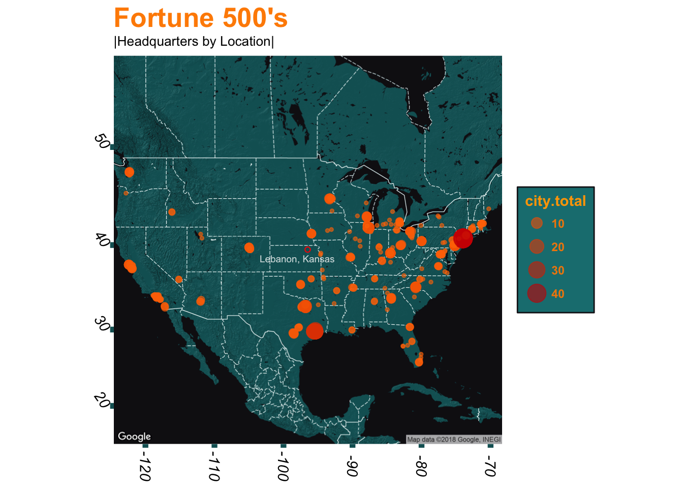
The above map is pretty nice, no?
Many times it can be useful to overlay a heat element to show the density of your data. Many tutorials do this when mapping density of crime activity, for instance.
Fortune_500_Plot2 <- ggmap(mymap) +
scale_color_gradient(low = "#ffb700", high = "#ff7700") +
stat_density_2d(data = Fortune_500s, aes(x = x, y = y, fill = ..level.., alpha = ..level..), geom = "polygon") +
scale_fill_gradient(low = "chartreuse", high = "yellow") +
scale_alpha(range = c(0, .5)) +
geom_point(data = Fortune_500s, aes(x = x, y = y), color = "#FF6600", alpha = 0.5) +
theme(legend.background = element_rect(fill = "#187d80", linetype = "solid", color = "#17151c"), legend.text = element_text(color = "tan", face = "bold"), legend.title = element_text(color = "tan", face = "bold")) +
theme(legend.key = element_blank()) +
guides(color = guide_legend("Total HQ’s"), fill = guide_legend("Total HQ’s"), alpha = guide_legend("Total HQ’s")) +
ggtitle("Fortune 500 Companies", subtitle = "|Headquarters Throughout America") +
theme(plot.title = element_text(size = 20, color = "peru", face = "bold")) +
theme(axis.text.x = element_text(angle = -90, hjust = .5, vjust = 0.5, color = "black", size = 11, face = "italic"),
axis.text.y = element_text(angle = -55, hjust = 1, vjust = 0.5, color = "black", size = 11, face = "italic")) +
theme(axis.title.x = element_blank(), axis.title.y = element_blank()) +
theme(axis.ticks.x = element_line(color = "#126063", size = 2),
axis.ticks.y = element_line(color = "#126063", size = 2))

cities <- data_frame(X = c(-74.00597, -95.3698, -87.6298, -122.4194), Y = c(40.71278, 29.76043, 41.87811, 37.77493), City = c("New York", "Houston", "Chicago", "San Francisco"))

Fortune_500_Plot2 +
geom_point(data = cities, aes(x = X, y = Y), color = "red", alpha = 0.75) + geom_text(data = cities, aes(label = City, x = X, y = Y + -.75), size = 2.5, alpha = .7, color = "red")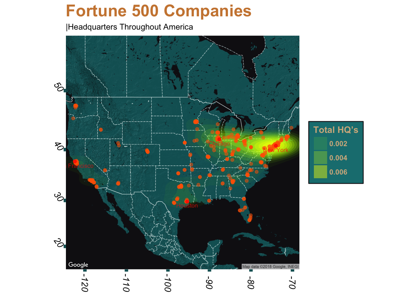
And that is it! Which map do you prefer more? My favorite is the first one due to how quickly we can make out the cities with most Fortune 500 headquarters based simply by the size of the mapping points.
As far as the second plot is concerned, I think that in most cases a heat density function would be better applied on a smaller scale, such the municipal level.
Anyway, this was my first experience in ggmap and it was definitely a good one!
Migrated over from my original Wordpress blog